Surely, one of the benefits of technology-based businesses is that it’s much easier to make data-based decisions – to “drive by the numbers”.
Superficially, this seems like it should be easy – just look at the data and decide what to do, right? However, in every company I’ve seen, it’s always been painful.
Hopefully, this will help you avoid some of that pain.
Six Steps to Metrics Heaven
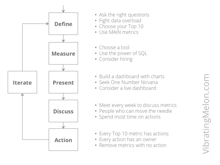
I believe there are 6 steps to “metrics heaven”:
- Define
- Measure
- Present
- Discuss
- Action
- Iterate
Sorry, there are no short cuts; you have to get all 6 right to be successful.
Step 1 – Define
Ask the Right Questions
Your path to Metrics Heaven starts simply by asking the right questions.
Firstly, try to state the question behind each metric as unambiguously as possible. Secondly, explain in plain English what this question means and why it’s important to your business – the context.
Example:
Question: “Of the users that have signed up in the past 12 months, what percentage have logged in in the past 1 month?”
Context: “This metric measures our ability to keep users coming back to our site. This is vital to our core business model as we pay $40 on average to acquire each new user and can only make a profit on them if they keep coming back.”
Clear definition of the question is particularly important because the person responsible for actually answering the question – writing the database query, wrangling Google Analytics, etc – is often not the person framing the question. So, any ambiguity has the potential to result in an answer that is misleading or just plain wrong.
Fight Data Overload
If you try to measure, track, discuss and action too many metrics, you’ll lose track of what’s important. You’ll lose sight of the forest for the trees.
Data overload is an insidious problem. The addition of each new metric seems innocuous so it’s hard to say no. Plus, there’s a tendency for people to want to get their group’s name “up in lights”. But it’s vital that you do say no. Otherwise, here’s what I’ve seen happen every time:
- pulling and calculating all the metrics becomes a chore and takes forever
- you end up with a big and unwieldy dashboard
- the dashboard takes more than 30 minutes just to run through with everyone during the metrics meeting
- people fall asleep or get distracted by their laptops/iPads/iPhones
- you run out of time to discuss actions
- people start to view the metrics meeting as a pain and find excuses to avoid it
Top 10 Metrics
To avoid overload, you need to identify a maximum of 10 metrics. This “Top 10” constitutes your top-level dashboard.
By “top-level dashboard”, I mean the dashboard that is shared with the whole company, which the executive team uses to drive the business and the first – and maybe only – set of metrics you review when you meet.
Each group or department may have its own dashboard too. There may be multiple levels of dashboards that dive deeper and deeper into the internals but don’t let those pollute your Top 10.
Your Top 10 metrics dashboard will probably be something you’ll want to work to automate so that it’s available live, displayed on a big flat-screen in your office, etc (more on that later).
To help ensure that you don’t grow beyond 10 metrics, use his rule: if someone wants to add a metric to the top-level dashboard, they have to choose one to remove also and justify why the one they want to add is more important than the one they want to remove.
Now, let’s look at how to identify which metrics should be in your Top 10…
MAIN Metrics
I have come up with a handy-dandy acronym to help identify the metrics that you should choose, particularly your Top 10 metrics; “MAIN”:
- Meaningful
- Actionable
- Isolatable
- Not misleading
Let’s look at these 4 in more detail…
Meaningful
Is the metric a true and valid indicator of success in your core business?
A good way to ask this is to pose the following question:
“if this metric changes in the right direction, and nothing else changes, will my business be doing better?”
If the answer to this question is no, then you may have identified a useful metric to measure and try to impact, but it’s unlikely that you’ve identified a Top 10 metric.
Actionable
There’s not really much use measuring something if you can’t do anything about it. You must be able to “move the needle”.
Metrics where you can’t move the needle are potentially interesting in terms of giving you a better understanding of what drives your business but almost certainly are not Top 10 metrics.
Isolatable
It’s vital that you choose and define metrics in such a way that they do not vary based on other, independent variables, whether those variables are in your control or not.
You need to be confident in measuring the effect of the actions you take to move the needle. You need to avoid the age-old problem of confusing correlation with causation.
A classic example in web businesses is not insulating your metrics from the impact of fluctuations in traffic caused by other factors. For example, you may have been measuring the number of user adds on a weekly basis and be working aggressively to drive up that number by reducing friction in your sign-up funnel. The week after you launch a slew of sign-up funnel optimizations, you get 25% more users. Yay for you – it worked – gold star.
Not so fast. It turns out that what actually happened was that an article in a local style magazine that your PR agency setup some weeks back was finally published which drove 25% more traffic to your homepage. Your conversion rate actually stayed the same.
To isolate a metric as far as possible, first frame the question in such a way that it’s not impacted by other variables. The easiest approach to this is to always define metrics in terms of rates, not in terms of absolute numbers – e.g. “what % of users that started down the signup funnel completed it last week?” Not, “how many users signed up last week?”
Lastly, always be suspicious if it seems too good to be true. Dig deeper to check whether your action really was the cause of the change.
Not Misleading
Lastly, even if a metric is isolatable, it may also be misleading in other ways. It may give a false negative or false positive, or otherwise cause you to react in the wrong way.
It’s important to define metrics in such a way that they are hard to misinterpret. Even if that’s not completely possible, it’s important to highlight the ways the metric could be misinterpreted when it is discussed.
Another classic example from the web is measuring the cost effectiveness of various CPC (cost-per-click) advertising campaigns. You may find that certain keywords or certain channels allow you to buy traffic at a lower cost. So, you decide to spend more money on those channels and reduce your spend on other channels. However, not all traffic is created equally. You may find that the users/customers brought in by the cheaper CPC rates actually generate proportionally less revenue for you so it’s worth paying more for higher quality traffic.
The danger of misleading metrics is one of the main reasons why stating the context of each metric (as discussed above) is so critical.
Step 2 – Measure
So, you’ve defined your Top-10 MAIN metrics in a precise and unambiguous way. Now you just need to measure them.
Easy, right?
Um. Mostly not. Measuring is usually hard for a variety of reasons:
- the relevant data is spread across multiple systems (your database, Google Analytics, MixPanel, AddThis, etc)
- data is buried in the depths of your system and extracting it requires in-depth knowledge of your systems (and probably wicked SQL skills too)
- the people with the know-how to extract the data are probably engineers who are busy with other things and consider extracting metrics beneath them
- metrics were not really considered when the original system was built so the “instrumentation” has to be added retrospectively; this work contending with other product feature work
- lots of manual steps are required, making it a chore
Tools
The good news is that there is a growing range of tools available to help. The bad news is that any tool, if badly used, can be worse than no tool at all.
Let’s look at a few…
Google Analytics (aka “GA”)
I hate Google Analytics. However, I can’t argue with the price. And it’s incredibly powerful…if you can work out how to use it. It’s unfortunately incredibly unintuitive. It’s a camel (horse designed by committee).
The good news is that it’s fairly ubiquitous so you probably already have people on your team who have experience with it.
Mixpanel
I like Mixpanel. I have no relationship with them other than as a happy customer. Mixpanel does the 10% subset of Google Analytics that you actually need and does it well – the charts make sense, things are consistently referred to by terms that make sense. It’s not free but it’s not expensive compared to the value it provides, in my opinion.
KissMetrics
Personally, I had a bad experience with KissMetrics but that’s just one data point. They are probably Mixpanel’s main competitor.
SQL Queries
The data in your app is probably in a relational database. That means you need at least one SQL ninja to write queries on that database. SQL is a technology that is older than I am and therefore is definitely not cool but it does what it does better than anything else, if you know how to use it.
Unfortunately, modern web frameworks mostly insulate developers from having to use SQL directly. Whilst this may be a good thing from the perspective of developer productivity and “separation of concerns”, it means that the number of engineers that can write complex SQL queries is reducing.
Microsoft Excel
There ain’t no shame in Excel, in my opinion. Likewise, Google Sheets, although the graphs are much better in Excel. Both have plugins to pull in data from various sources, including Google Analytics.
Hire Someone
You might want to consider hiring a “data analyst” – i.e. someone who runs the metrics process as their main job, rather than it being done badly as a part-time job by others. I use parentheses around the job title because I’ve found that people who self-identify as Data Analysts have a tendency to be quite academic and unable to roll their sleeves up and actually grapple with Google Analytics to extract the numbers.
I would suggest you’re better off starting with a technically-minded digital marketing person. They’re like unicorn poop in the current job market so good luck.
Step 3 – Present
Once you’ve got the actual data, you now have to present it in a clear way that can be digested by others.
Build a Dashboard
The first step in presenting metrics is to build a dashboard that quickly and clearly communicates your “Top 10” metrics. Don’t worry about finessing the dashboard for metrics outside your Top 10; it’s better to get the Top 10 dashboard as good as possible before you spend time elsewhere.
Excel is the most common tool used for this purpose and, to repeat myself, I believe there is no shame in Excel. However, as discussed above, there are an increasing range of more automated options.
Use Charts
Some people are able to “see the matrix” – they can see patterns and trends in raw numbers. But, most people can’t, including a lot of very technical people.
So, show charts in your dashboard, not numbers – they really help highlight trends over time, progress versus budget and other patterns.
“One Number” Nirvana
I already talked about limiting yourself to a maximum of 10 top-level metrics. I’m going to go a stage further and say that every business has just ONE number that represents how successfully the business is performing. This may seem impossible at the outset but but I bet you it’s not.
So, set yourself the stretch goal of identifying that One Number. You’re unlikely to get to it immediately so start with your Top 10 and see if you can iterate towards your One Number. It may be one of your Top 10 or it may be a calculation based on a number of metrics.
Simplistically, you might say that revenue or profit is the One Number for any business but absolute revenue or profit is driven as much by scale as anything else. Before you can scale to maximize revenue or profit, you need to have a business model and product that is worth scaling and you’ll also likely need to persuade investors to give you the cash required to scale. That’s where your One Number comes in. So, your One Number is likely to be something like customer acquisition cost (CAC/CPGA) or profit per user add.
Build a Live Dashboard
Data junkies will argue that the ultimate nirvana is to have a live dashboard that shows your One Number and Top-10 metrics, with graphs, on a web page that anyone in the company can view at any time to see a real-time view of how the product and business is performing.
But, however easy it is to get view the metrics, that does not remove the need to meet to discuss them and to action them. So, let’s talk about that.
Step 4 – Discuss
Having your metrics beautifully presented is no use if you don’t actually talk about them as a team.
Meeting to discuss the metrics regularly keeps them in the front of everyone’s minds, makes sure that everyone understands what actually drives your business and, most importantly, is the venue to come up with your action plan for pushing them in the right direction.
Meet Weekly
The only cadence that I have seen work when it comes to reviewing the metrics in an online business is weekly. A month is an aeon in Internet time. Daily is good for quota driven sales team but too much for a startup team that is trying to build and rapidly iterate a product.
So, set a fixed time to meet every week.
The most important people to have at the meeting to review metrics is the people in the company that can actually impact those metrics. Others can attend but you don’t want too many cooks.
Manage the Time
It’s very easy for the weekly metrics meeting to turn into a mechanical run through of all the metrics. This is especially true if you’ve let your dashboard grow beyond 10 metrics or if you spend time diving into lots of very detailed metrics below your Top 10.
Most important is that you spend at least as much time on actions as you do on reviewing the numbers. People who attend the weekly metrics meeting should be expected to have reviewed the metrics ahead of the meeting and come to the meeting armed with questions and suggestions for actions.
Step 5 – Action
Having perfectly accurate and beautifully-presented metrics that you discuss weekly as a team is useless if you don’t actually do anything about them.
What’s surprising is how often this happens. People come to the weekly data meeting, review the metrics, ask questions and then go back to their jobs.
If this is what’s happening, you’re wasting time preparing the metrics and might as well get a job rearranging deckchairs on a sinking cruise ship.
Set Targets
It’s way easier to move a metric in the right direction if you specify a target of where you’re trying to get to.
Frankly, any target is better than none but it’s of course better to have a target that is achievable. It’s better to start with a small, achievable increment and then move the target as you get better and more sophisticated in impacting your metrics through action.
To learn more about this, read a good dieting book. Trying to either “stop being fat” or “lose 40lbs” is much, much harder and more demotivating than setting an achievable target for each week.
Actions for every metric
Every metric in your Top 10 should have a corresponding list of actions aimed at moving the needle in the right direction, along with an owner for each metric. These can be marketing efforts, new features, A-B tests, whatever.
If you repeatedly don’t come up with actions for a Top 10 metric, ask why. It probably means you should remove that metric from your Top 10 and replace it with something you feel is more important and which you can actually impact.
Likewise, if agreed actions don’t get performed by their owners, you can keep people honest by asking whether people still think the metric is important in terms of making the business successful. If it is, then ask what other tasks they are doing that are more important. If it’s not, remove the metric.
Step 6 – Iterate
I would say that the chance that you’ll choose the right set of metrics, be able to extract all the data you need, present them clearly and build an action plan to move the needle first time around is approaching zero.
Expect it to be painful initially. Expect it to take time. Expect that you’ll need to iterate.
Summary
If there are just 4 things I suggest you take away from this, they would be:
- Ask the right questions
- Fight data overload
- Focus on action
- Iterate and expect it to take time to get right
Agree/disagree? Please leave a comment (link is top-right of the page).